Choose the piece that is staying
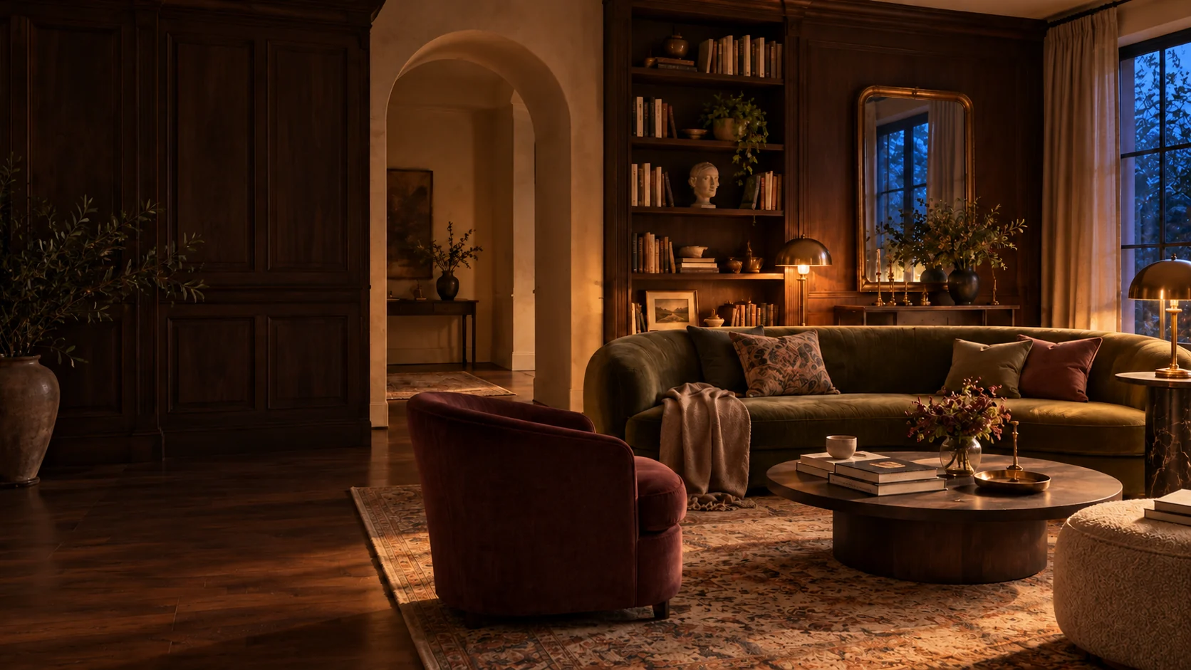
Begin with an object you plan to keep: the sofa, a cabinet, a rug or a favourite chair. Look at it beside the floor and walls. Notice whether it feels warm, cool, muted or vivid in your room. This is more useful than choosing a completely new palette and discovering that every existing surface conflicts with it. The anchor does not have to be the most expensive piece; it should be a dependable part of the room's next chapter.
Write down the materials that are not changing and the feeling you want to strengthen. Perhaps the room needs softer contrast around a dark cabinet or a richer accent beside a pale sofa. Keep those decisions separate from a trend name. A colour scheme should explain what you will keep and how the room will be used, not require every object to belong to a single decorative category.
Collect a few references, not an endless board
Gather a small set of colours from the existing piece and things that sit comfortably beside it. A textile, a book cover or a ceramic object can provide a starting direction. Use Palette Lab to sample a photograph locally if that helps you organise the ideas. Choose a photo taken in representative light without a strong filter, and remember that the camera still changes what you see.
The tool extracts digital colours from pixels. It does not identify a paint brand, confirm a material's real colour or account for every lighting condition. Treat a HEX value as a way to communicate a direction. If you are considering paint or fabric, obtain suitable physical samples and compare them with the actual room before buying a large quantity.
Give each colour a job
A simple palette can have a background colour, a connecting mid-tone and one stronger accent. These are roles, not a fixed percentage rule. The background supports large areas; the mid-tone relates existing materials; the accent gives a useful point of emphasis. Look for colours already doing some of this work so that the room does not need to be recreated from scratch.
Try the accent on a small, movable object first. It might be a cushion you own, a book jacket or a folded textile. Put it near the anchor, then view the arrangement from the entrance and from the usual seat. If it dominates more than intended, change its position or size before deciding the colour itself is wrong. Contrast depends on what surrounds it.
Compare samples in ordinary light
Keep samples near the surfaces they will meet rather than holding them against a bright white screen. View them at the times you use the room: a morning beside the window, a grey afternoon and an evening with your normal lamps. Observe how they relate to the fixed flooring and furniture. A colour that looks calm at one time can feel very different under another light.
Follow the sample product's instructions and check the surface before applying anything. For a rental, confirm which changes are permitted. Take notes rather than relying on photographs alone, since phone exposure and white balance can shift between shots. Leave the preferred sample in view long enough to decide whether you like living with it, not only looking at it briefly.
Let texture create variation
A restricted palette does not need identical surfaces. A matte textile, a warm wood grain and a glazed object respond differently to light even when their colours are close. Use those differences to make a room feel layered. Before adding another colour, see whether a change in texture or finish would provide the interest you are missing.
Keep the material's practical use in view. A beautiful finish that is unsuitable for a frequently touched surface is not a helpful palette choice. Read the relevant care and product information, and compare samples where possible. The room's light, household needs and existing materials decide what works better than an inspiration picture with perfect styling.
Keep a palette you can actually reuse
Save the selected digital swatches, a photo reference and a short explanation of each colour's role. Add the exact product details only after you choose real samples or items. Distinguish a sampled HEX value from an actual paint or textile reference in your notes. This makes the board useful later without creating a false match.
Room Studio can turn the mood into an initial plan, and the 3D Room editor can help test a wall colour beside furniture references. Neither shows a colour-certified preview of your physical room. Use the digital tools to narrow the direction, then let physical samples make the final decision. A good palette supports the pieces you keep and remains flexible as the home changes.
Try a measured furniture arrangement in the 3D Room atelier ↗
Keep the useful part.
Save the full guide to Pinterest or download a vertical graphic. Room imagery is illustrative and AI-generated, not a photographed result.